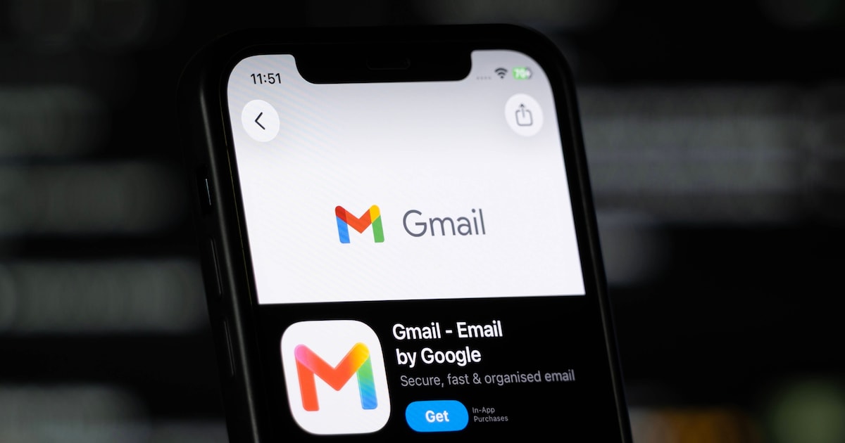
Visual change in Gmail divides opinions
Google promoted an update to the Gmail layout for browsers, mainly changing the colors of traditional icons. The modification, although subtle, provoked a strong negative reaction among some users who preferred the previous appearance.
Why the change generated protests
Many internet users reported that the new shades make it difficult to quickly identify the buttons, impairing the fluidity of daily life. The company has not yet released an official reason for the chromatic choice, but it is speculated that the goal is to align the service with the most recent visual identity of Google Workspace.
Solutions already available
Although there is no official option to revert the theme, the technical community is already sharing extensions and browser adjustments that restore the classic look. Among the most cited alternatives are:
- Specific extensions for icon customization
- Lightweight scripts that replace the standard colors
- Advanced Chrome settings that ignore the update
What to expect from Google
Experts recommend waiting for a possible update that brings customization options. Meanwhile, users can test community solutions to maintain productivity without the new colors.
The change reinforces the debate about how much companies should prioritize feedback before implementing visual changes in tools used by millions of people daily.